Argus
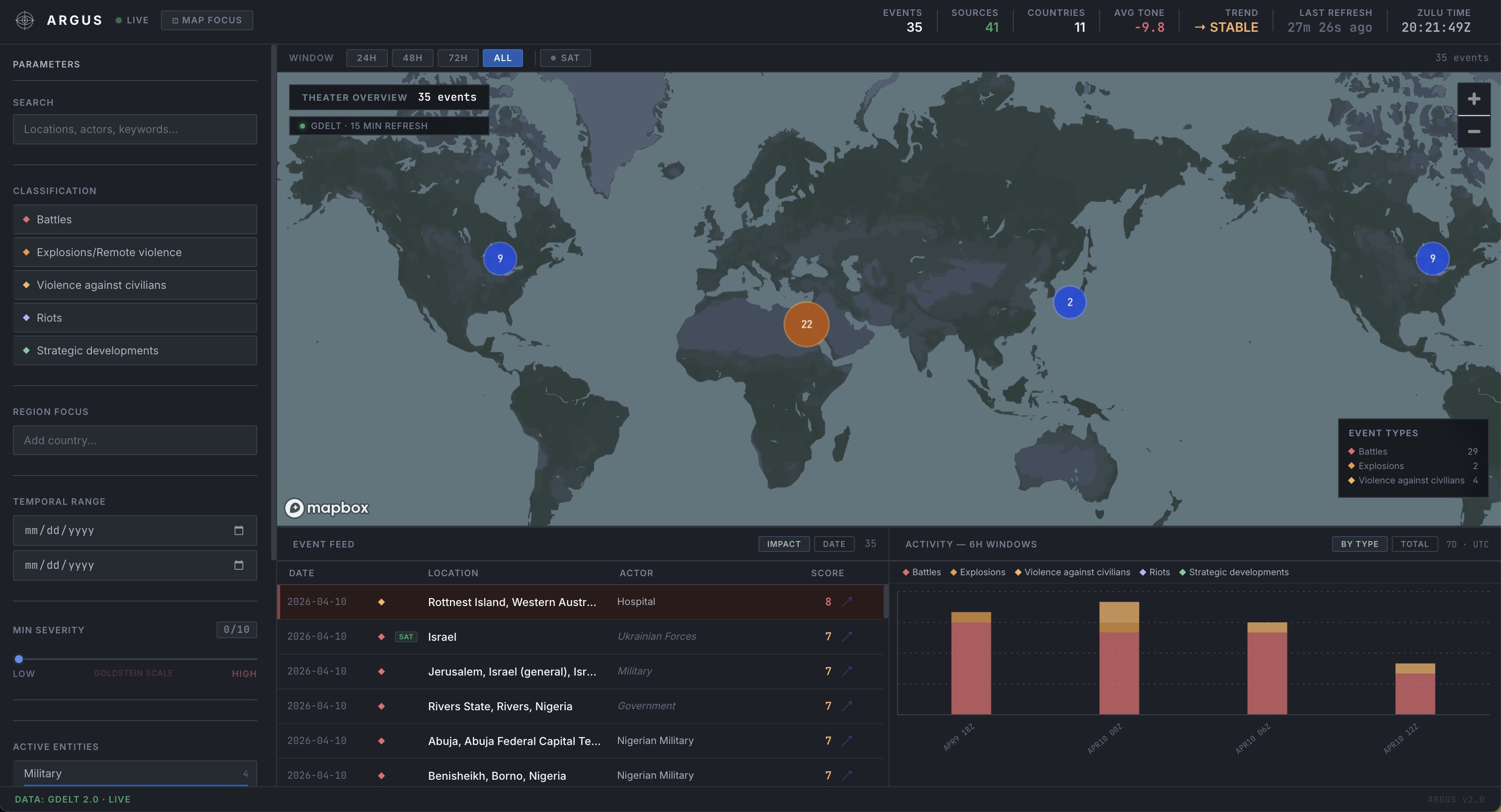
GDELT is a public database that monitors the world’s news in real time: 300+ sources, updated every 15 minutes, hundreds of thousands of events logged every day. The problem is that most of what it flags as conflict isn’t: crime reports, court cases, and sports stories that got mislabeled. A map built directly on that data is useless. It’s just noise.
I needed to make that data actually usable, which meant deciding what to filter, how, and in what order. I designed a layered approach, drawing on Palantir’s open-source documentation for the pipeline architecture, where simple rules handle the obvious cases first (fast and free), then an AI reads the source article and scores genuinely ambiguous events before making a call. Sequencing it that way kept costs low and made every decision traceable: you can always see why something was included or rejected.
I also recognized that checking a media report against more media reports is a weak form of verification. So I brought in NASA satellite thermal data as a second, independent source. When a reported explosion lines up with a heat signature at the same location and time, that’s physical evidence rather than another headline saying the same thing. The interface labels every event by its evidence type so there’s no ambiguity about what you’re looking at.
It runs on a 15-minute automated cycle and is live at argusosint.vercel.app.